How Mobile-First Design Influences Online Success: Trends and Strategies for 2024 and Beyond
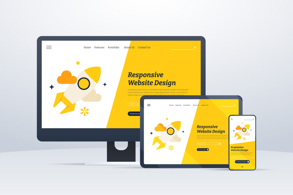
Mobile-first design is increasingly crucial for achieving online success. As most users now access the web via smartphones, ensuring your website is optimised for mobile is more than a necessity—it’s a priority. Websites designed with a mobile-first approach are built from the ground up to provide an optimal viewing and interaction experience for mobile users. This method prioritises speed, responsiveness, and touch-friendly interfaces, making it easy for visitors to navigate your site no matter the device.
Using a mobile-first strategy directly affects your site’s effectiveness and user engagement. When your site responds well on mobile devices, it not only meets user expectations but also contributes to a positive perception of your brand. A seamless mobile experience keeps users engaged, reducing bounce rates and increasing the likelihood of return visits. Your website is often the first point of contact with your brand, so making a strong first impression is crucial to retaining interest.
How Mobile Responsiveness Impacts SEO Rankings
Search engines prioritise mobile responsiveness when ranking websites. A mobile-optimised site ensures that your content is not only accessible but also easy to navigate on a small screen. This means using responsive design techniques to make sure text, images, and other elements scale properly across different devices. By improving the mobile experience, you directly boost your SEO, as search engines rank sites higher that provide a seamless experience on mobile.
Mobile responsiveness impacts user engagement metrics such as time on site and bounce rate, which are critical SEO signals. Search engines interpret a low bounce rate and longer browsing sessions as indicators of a quality site that merits a higher ranking. By optimising your website for mobile users, you’re not just catering to consumer preferences but also enhancing your visibility in search results.
Design for Speed
One of the key aspects of mobile-first design is speed. Your mobile site must load quickly to retain visitors, as even a one-second delay can lead to a significant drop in user satisfaction. Techniques such as image compression, efficient coding practices, and minimising redirects can dramatically increase page load times. It’s crucial to regularly test your mobile website’s speed using tools that simulate different devices and connection speeds to ensure optimal performance across all scenarios.
Adopting newer technologies like AMP (Accelerated Mobile Pages) can further enhance your mobile site’s speed. AMP is an open-source library that provides a straightforward way to create web pages that are compelling, smooth, and load near instantaneously for users. Employing such technologies not only improves user experience but also benefits your SEO, as speed is a ranking factor for search engines.
Staying Ahead of the Curve
Keeping your finger on the pulse of digital marketing trends is vital to maintain and enhance your mobile marketing strategies. As new technologies emerge and consumer behaviours evolve, adapting your approach can help keep your brand relevant and competitive. For instance, the increasing use of voice search and AI-driven recommendations requires updates to content strategy and SEO to maintain visibility and engagement.
Integrating social media with your mobile marketing efforts can leverage these platforms’ vast user bases to increase your reach. Tools that facilitate direct communication and transaction on these platforms, such as chatbots and social commerce features, are becoming essential components of a robust mobile strategy. These trends highlight the importance of staying current with digital marketing trends to effectively engage your target audience through their preferred channels.
Using Progressive Web Apps in a Mobile-First Strategy
Progressive Web Apps (PWAs) are transforming how you interact with your mobile audience. By combining the best features of mobile websites and native applications, PWAs provide a high-quality user experience that loads quickly and operates smoothly across all devices. This approach allows users to access your content even when offline, thanks to the app-like interface that caches important information during their initial visit.
PWAs are incredibly beneficial for user retention. The ability to send push notifications directly to a user’s device enhances engagement, reminding them to return and interact with your content or offers. This direct line of communication is a powerful tool for increasing conversions and building a loyal customer base. As your users enjoy a seamless and feature-rich browsing experience, your brand stands out as a forward-thinking choice in a crowded digital marketplace.
User Personalisation Through Mobile Experiences
Personalisation in mobile design is crucial to meet and exceed the expectations of today’s tech-savvy users. Customising the user experience based on individual preferences, browsing history, and past interactions can significantly enhance engagement. Tailored content and recommendations ensure that your visitors find value in every interaction, thereby increasing the likelihood of conversion and loyalty.
Personalisation techniques include adjusting the layout and functionality of your mobile site to suit user preferences, such as dark mode, text resizing, and intuitive navigation paths. Such adaptability not only improves usability but also reinforces your commitment to customer satisfaction. By focusing on individual user needs, you create a more inclusive and responsive environment that reflects the diversity of your audience, ultimately fostering a deeper connection with your brand.
If your website adapts to user needs and preferences, it builds a stronger connection with your audience, driving both retention and conversions. Prioritise your mobile strategy to ensure your business thrives.